
Monograms are a classic way to add a personal and elegant touch to clothing, towels, bags, uniforms, gifts, and home textiles. While a monogram may look simple, converting its letters into clean machine embroidery requires careful planning. Embroidery Digitizing Services turn monogram artwork or typed initials into embroidery files that machines can accurately read and stitch.
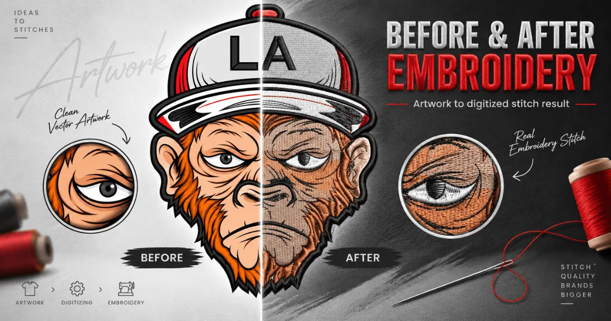
The process involves much more than choosing a font and pressing a button. Digitizers must consider letter size, stitch direction, fabric type, thread thickness, spacing, and the embroidery machine being used. Small mistakes can make letters look crowded, uneven, or difficult to read.
This guide explains how professional digitizers handle monograms, from artwork preparation to final testing. It also covers fonts, stitch types, spacing, fabric considerations, common problems, and tips for getting high-quality monogram embroidery.
What Is a Monogram in Embroidery?
A monogram is a design made from one or more letters, usually representing a person's initials, name, business, organization, or family. Monograms are commonly embroidered on shirts, robes, towels, handkerchiefs, caps, jackets, blankets, and bags.
A monogram can be very simple, such as one initial in a script font. It can also contain three initials arranged in a traditional style. Some designs include decorative borders, flourishes, symbols, or small elements around the letters.
Because monograms depend heavily on typography, accuracy is particularly important. A slight change in spacing or stitch direction can affect how the entire design looks.
Why Monograms Need Professional Digitizing
A regular image file does not tell an embroidery machine how to create stitches. A JPG, PNG, or similar image only contains visual information.
Digitizing converts that visual information into instructions. These instructions tell the machine where to place stitches, what type of stitch to use, how dense the design should be, and when to change colors.
Professional Embroidery Digitizing Services understand how to translate lettering into practical embroidery. They adjust the design according to its intended size, fabric, thread, and machine requirements.
This is especially important for small monograms. At a large size, a letter may have enough space for detailed stitching. At a small size, the same letter may become too dense or lose its shape.
How the Monogram Digitizing Process Works
Reviewing the Monogram Artwork
The first step is reviewing the artwork or lettering concept. The digitizer checks the initials, font, layout, decorative elements, and intended embroidery size.
If the customer provides a finished image, the digitizer examines whether the letters are clear enough to reproduce. If the design is only an idea, the digitizer may need to recreate the lettering digitally before beginning the stitch work.
The goal is to understand exactly what the finished monogram should look like.
Choosing an Appropriate Font
Font selection is one of the most important parts of monogram digitizing.
Some fonts have thick, bold characters that are easy to embroider. Others contain thin strokes, tight curves, or elaborate flourishes that can become difficult at smaller sizes.
Script fonts are popular for monograms because they create an elegant appearance. However, they need careful handling because connected letters can easily become too crowded.
A professional digitizer may recommend a different font if the original choice will not produce readable embroidery.
Setting the Correct Letter Size
Embroidery size affects almost every part of the digitizing process.
A monogram intended for a large bath towel can usually contain more detail than a small monogram placed on a shirt cuff. If the same design is simply scaled down, the stitches may become too dense and the narrow sections may disappear.
Professional digitizers adjust the stitch structure for the actual embroidery size rather than relying only on automatic scaling.
Creating Stitch Paths
After selecting the font and size, the digitizer creates stitch paths for each letter.
A stitch path determines the direction and sequence in which the machine will sew the design. Good sequencing can reduce unnecessary jumps, trims, and thread changes.
The digitizer also considers how the thread will behave as the machine moves through curves and corners.
For example, rounded letters may require carefully planned stitch directions to maintain smooth edges. Straight portions may need a different structure to keep them crisp.
Stitch Types Used for Monograms
Satin Stitch
Satin stitches are among the most common choices for embroidered lettering.
They create a smooth, slightly raised appearance and work particularly well for medium-sized letters. Their polished appearance makes them popular for names, initials, and decorative monograms.
However, satin stitches have practical limits. Very wide satin areas can become unstable, while extremely narrow areas may not provide enough coverage.
Fill Stitch
Fill stitches are useful when monograms contain large areas that need complete thread coverage.
They can be used for larger letters or decorative elements. The digitizer controls density and stitch direction so the filled area does not become unnecessarily heavy.
Running Stitch
Running stitches can be useful for delicate outlines, fine details, and certain decorative monogram styles.
They generally use less thread than dense fills. However, they may not provide the bold appearance required for traditional monogram lettering.
Specialty Stitching
Some monograms include decorative borders, textures, or flourishes. Depending on the design, additional stitch techniques may be used.
The digitizer chooses the appropriate stitch structure based on the artwork and fabric rather than applying the same method to every monogram.
Managing Letter Spacing and Alignment
Spacing is one of the easiest details to overlook and one of the most important for professional results.
Letters placed too close together can merge visually once embroidered. This is particularly common with script fonts and initials containing curves or overlapping strokes.
Letters placed too far apart can make a monogram appear disconnected.
Digitizers adjust spacing based on the actual stitched appearance rather than relying entirely on the spacing shown on a computer screen.
Alignment is equally important. Each letter must sit at the correct height and position. When three initials are used, their relative sizes and positions need to match the selected monogram style.
Handling Different Monogram Styles
Single-Initial Monograms
Single initials are among the simplest monograms to digitize. They can be embroidered in bold, script, serif, or decorative fonts.
Despite their simplicity, the letter still needs appropriate stitch density and underlay. A poorly digitized single initial can have uneven edges or excessive thread buildup.
Three-Letter Monograms
Three-letter monograms require more careful layout.
Traditional styles often use the surname initial as the larger center letter, with first and middle initials placed on either side. Other designs use three equally sized letters.
The digitizer must understand the intended arrangement before creating the stitch file.
Interlocking Monograms
Interlocking initials overlap or connect with one another. These designs require careful sequencing because the digitizer needs to determine which portions should appear in front and which should appear behind.
Poor sequencing can create unwanted thread buildup or make the letters difficult to distinguish.
Script Monograms
Script monograms are elegant but can be technically challenging.
Thin strokes may require special attention to maintain visibility. Curves and connecting lines must also be carefully digitized to prevent gaps or excessive thickness.
The final goal is to preserve the character of the original lettering while making it suitable for machine embroidery.
How Fabric Affects Monogram Digitizing
The same monogram file may not work equally well on every fabric.
Towels and Terry Cloth
Towels have a textured surface that can hide small lettering. Digitizers may use suitable underlay and density adjustments to help the letters remain visible.
A water-soluble topping can also be used during embroidery to help prevent stitches from sinking into the pile.
Shirts and Lightweight Fabrics
Lightweight fabrics can stretch during embroidery. If the design is too dense, the material may pucker.
Professional digitizing considers this risk and uses appropriate underlay, density, and stitch direction.
Denim and Heavy Fabrics
Denim can support bold embroidery, but the digitizer still needs to avoid unnecessary stitch density.
Heavy fabric does not automatically mean that every design can use extremely dense stitching. Excessive thread can create stiffness and distort the design.
Caps and Structured Materials
Monograms embroidered on caps have additional challenges because of their curved surface and limited embroidery area.
Letters need to be positioned carefully, and stitch direction may need to account for the shape of the cap.
The Importance of Underlay
Underlay stitches are placed beneath the visible embroidery.
They provide a foundation for the top stitches and can help stabilize the fabric. They can also improve coverage and prevent certain areas from appearing weak.
The type and amount of underlay depend on the fabric, design size, stitch type, and embroidery application.
Too little underlay may result in unstable embroidery. Too much can increase bulk and create unnecessary stiffness.
Professional Embroidery Digitizing Services balance these factors rather than using identical underlay settings for every monogram.
Controlling Stitch Density
Stitch density refers to how closely stitches are placed together.
If density is too low, the fabric may show through the lettering. If density is too high, the design can become stiff, heavy, or distorted.
Monograms with thin lines and small letters need especially careful density control.
Digitizers also consider the thread itself. Different thread types and weights can influence how much coverage a particular stitch structure provides.
Preventing Puckering and Distortion
Puckering occurs when fabric gathers around the embroidered area.
It can result from excessive density, inadequate stabilization, poor hooping, incorrect underlay, or unsuitable digitizing.
Although stabilization is partly an embroidery setup issue, good digitizing helps reduce the risk. Stitch directions and density should work with the fabric rather than against it.
A professional digitizer may also recommend a suitable stabilizer based on the material and design.
How Digitizers Handle Small Monograms
Small monograms are particularly challenging because there is very little space for detail.
A font that looks beautiful at 2 inches may become unreadable at half an inch. Fine strokes can disappear, counters can close, and letters can merge.
For this reason, digitizers may simplify certain details. Tiny decorative elements may be removed, while narrow strokes may be adjusted to maintain visibility.
This is not about changing the identity of the design. It is about adapting the artwork to the physical limitations of embroidery.
Testing the Digitized Monogram
A professional workflow usually includes testing before large-scale production.
The design can be stitched on a sample material that resembles the final product. This allows the digitizer or embroiderer to examine the actual result.
They can check letter clarity, spacing, density, thread tension, alignment, and overall appearance.
If something looks wrong, the digital file can be adjusted and tested again.
This step is valuable because computer previews cannot always show exactly how thread will behave on real fabric.
Common Problems With Monogram Embroidery
Letters Look Too Thick
Excessive density or unsuitable stitch settings can make letters appear heavier than intended.
Reducing unnecessary stitches and adjusting the stitch structure can improve clarity.
Fine Details Disappear
Small decorative elements may not survive when embroidered at a very small size.
The digitizer may simplify the artwork or modify the smallest details.
Letters Merge Together
This often happens when spacing is too tight, especially with script fonts.
Increasing the spacing or changing the stitch sequence can help separate the characters.
Fabric Puckers
Puckering may occur when the design places too much stress on the material.
Density, underlay, stabilization, and hooping should all be reviewed.
Uneven Letter Edges
Poor stitch direction or inappropriate stitch settings can produce rough edges.
Careful stitch-path planning helps maintain smoother outlines.
Choosing Professional Embroidery Digitizing Services
When selecting a digitizing provider, look beyond price.
Experience with lettering and monograms is important because typography creates challenges that are different from ordinary logos.
Ask whether the provider can work with your preferred font, embroidery size, fabric, and machine format.
It is also useful to review examples of previous monogram work. Look closely at small lettering, curves, spacing, and overall stitch quality.
A good provider should understand that a successful embroidery file is designed for production, not merely made to look attractive on a computer screen.
What Information Should You Give the Digitizer?
Providing clear information can improve the final result.
Tell the digitizer the exact initials or wording, desired dimensions, preferred font, thread colors, fabric type, placement, and embroidery machine format if known.
For example, a monogram for a cotton shirt sleeve has different requirements from one intended for a thick bath towel.
If you already have a specific layout, provide it as clearly as possible. A reference image can help communicate your expectations.
Why Machine Format Matters
Embroidery machines use different file formats.
The appropriate format depends on the machine brand and software being used. Common formats include DST, PES, EXP, JEF, and others.
The digitized design itself should be created carefully first, then exported into the required machine format.
Using the wrong format can prevent the machine from reading the file correctly or may cause important design information to be lost.
Monogram Color Selection
Thread color also influences how a monogram appears.
High contrast between the thread and fabric generally makes letters easier to read. Subtle color combinations can create a sophisticated appearance but may reduce visibility, especially with small lettering.
Metallic threads, variegated threads, and other specialty threads may require additional consideration.
The digitizer should account for the characteristics of the selected thread when planning the design.
How Technology Supports Monogram Digitizing
Modern digitizing software makes it easier to create, edit, preview, and organize embroidery designs.
Automated tools can assist with certain tasks, but professional judgment remains important.
Automatic conversion may produce excessive stitches, poor sequencing, or unsuitable lettering structures. Human review is often necessary to correct these issues.
The best results come from combining software capabilities with knowledge of embroidery behavior.
Benefits of Professionally Digitized Monograms
Professionally prepared monograms offer several advantages.
They can provide cleaner lettering, better stitch consistency, improved fabric compatibility, and more reliable production results.
A properly digitized design can also reduce unnecessary thread consumption and minimize problems during embroidery.
For businesses, this consistency matters when producing multiple garments or personalized products.
For individual projects, professional digitizing helps ensure that the finished item looks polished and intentional.
Conclusion
Monograms may contain only a few letters, but creating high-quality embroidered lettering requires considerable technical skill. Every detail matters, including font selection, size, spacing, stitch direction, density, underlay, sequencing, and fabric compatibility.
Professional Embroidery Digitizing Services transform ordinary lettering into machine-ready embroidery instructions while preserving the style and personality of the monogram. They also adapt designs to practical limitations such as small sizes, textured fabrics, curved surfaces, and different embroidery machines.
The most important lesson is that monogram digitizing is not simply an automatic conversion from text or an image to stitches. It is a design and production process that requires an understanding of both typography and embroidery.
When the design is carefully digitized and properly tested, even a simple set of initials can produce an elegant and professional result. Whether the monogram is being placed on a personal gift, corporate apparel, luxury towel, school uniform, or branded accessory, careful preparation can make the difference between ordinary embroidery and a polished finished product.